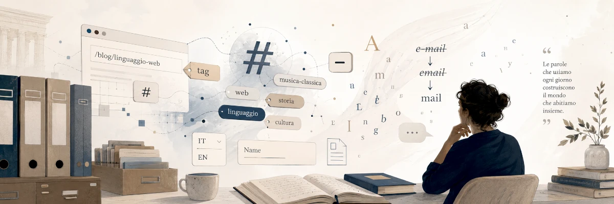
Sometimes the human mind takes strange paths, as it does in dreams. We focus on an apparently insignificant detail and, as we follow its implications, that detail becomes the white rabbit leading us down its hole. This is what happened to me one day while I was deciding how to write the tags for a personal website of mine.
A tag is a clickable word, or short phrase. It is used to classify, retrieve, and create connections between pieces of content that do not necessarily belong to the same section. In a tag cloud, this function becomes even more evident, because tags take on the appearance of a semantic and statistical menu. They do not merely indicate where one can go; they also suggest which themes recur most often and which words carry the greatest weight within the site as a whole.
At that point the apparently trivial question was this: how should I write them? All lowercase, as often happens on social platforms and in more informal classification systems, or with an initial capital letter, as if they were small navigation items? The issue seems marginal, almost typographical, and yet behind an interface detail there is often a small cultural history.
A tag, after all, is not merely a word, but a word to which the interface assigns a function. It no longer remains simply inside a sentence; it becomes a clickable object, capable of aggregating content, building paths, and turning a simple label into a navigation tool. In this sense it belongs to that family of words that digital culture has transformed into buttons, signs, filters, and calls to action: home, login, post, share, like, follow. The web has not merely hosted language; it has filled it with handles.
The difference between a category and a tag is subtle, but significant. A category says that an article belongs to a certain section, while a tag suggests that the article is also about something else. The category builds shelves; the tag stretches threads. The former organizes the site according to a hierarchy; the latter creates lateral crossings, freer and often more revealing. For this reason, the tag resembles a chapter in an index less than it resembles a marginal note, capable of linking content that, within a rigid structure, would remain distant.
It is no coincidence that the history of tags is tied to the culture of the social web. Before they became hashtags, and before they were absorbed into the daily grammar of social networks, tags were already a way of entrusting users with part of the work of classification. Alongside taxonomies built from above, systems began to appear based on words chosen, repeated, corrected, distorted, and shared by a community.
This is where a rather ugly and rather beautiful word enters the scene: folksonomy. The term combines folk and taxonomy, indicating not an official taxonomy, but a popular classification produced from below by users. It carries with it an entire historical moment of the web, when blogs, wikis, social bookmarking services, collaborative archives, and online communities seemed to promise a new spontaneous organization of knowledge.
A folksonomy is imperfect by definition. Where a traditional taxonomy seeks coherence, hierarchy, and terminological control, a folksonomy accepts synonyms, overlaps, fashions, and idiosyncrasies. One person may tag a piece of content as “classical music”, another as “guitar”, another as “Villa-Lobos”, “twentieth century”, or “Brazilian modernism”. The result may seem chaotic, but it is also informative, because it records not only what something is, but how people recognize it, remember it, and search for it.
An interesting example is MusicBrainz, the large collaborative music database, where more structured data coexist with folksonomy tags. In that context the tag is not a mere ornament, but a tool through which the community enriches information, adding nuances that a rigid classification would struggle to contain. A record can be associated with a genre, but also with an atmosphere, an instrument, a period, or a listening impression.
This elasticity explains why the graphic form of a tag is not a neutral matter. In a massive community system, it may make sense to normalize everything in lowercase, because the tag becomes raw material, aggregable data, a string to be compared with other strings. On a personal website, however, the tag can retain a greater degree of editorial intention. It can be a keyword, but also a small navigation item, almost a shelf label. This is where the reasonable temptation arises to write “Classical music” rather than “classical music”, “Villa-Lobos” rather than “villa-lobos”.
The apparently minute choice places two different cultures of the web in tension. On one side there is the social, statistical, aggregative culture, in which everything tends to be lowercase, comparable, and ready to become data. On the other there is the editorial culture, where words have a face, a form, a tone, and are not only metadata but also signs displayed to the reader. When a word enters the interface, it ceases to be merely a word, because it becomes classification, navigation, social gesture, and sometimes even a declaration of identity.
The passage from tag to hashtag is almost natural, but it does not consist merely in adding a graphic sign. Placing a hash sign (#) before a word means moving it from a classification system to a conversation system. The tag, in its more traditional use, helps retrieve; the hashtag also helps gather. It does not merely indicate that a piece of content is about a certain topic, but signals that this content is taking part in a public discourse.
The now almost mythological history of the modern hashtag is usually traced back to Chris Messina, who in 2007 proposed on Twitter that the # symbol be used to group conversations and topics. Of course, the hash sign was not born at that moment: it was already present on telephone keypads, in programming languages, in IRC channels, and in many technical conventions. But the social web has this power: it takes an existing sign, exposes it to millions of people, and suddenly changes its cultural status.
The hash sign thus becomes a small linguistic infrastructure. It is not a word, but it allows words to behave differently, making them searchable, aggregable, and traceable. A hashtag can be descriptive, ironic, political, promotional, or identity-related; it can organize a protest, accompany a picture of a cat, signal belonging, or participate in a trend. In any case, it shows that the web does not merely host writing, but modifies its habits.
Here the problem of graphic form returns. Hashtags, for technical reasons, do not like spaces. If I want to write “classical music” inside a hashtag, I must compact the words into a form such as #classicalmusic, #classical-music, or #ClassicalMusic, depending on the platform and its conventions. Spelling immediately becomes a compromise between machine and human reader.
At this point an old acquaintance from computer culture reappears: CamelCase. Writing ClassicalMusic, OpenSource, or BattlestarGalactica means removing spaces and using internal capital letters as visual joints. The name is picturesque, because the capital letters distributed along the compound word recall the humps of a camel. In technical contexts, CamelCase and its variants have long been used for the names of variables, functions, classes, brands, and products.
Here too, something interesting happens. A convention born, or at least stabilized, in technical environments re-enters common language through social media. In hashtags, CamelCase is not merely an aesthetic choice, because it can also become a matter of readability and accessibility. #ClassicalMusic is more readable than #classicalmusic, and for those who use a screen reader, capital letters can help the software recognize and pronounce the words in the sequence more accurately.
It is curious that, precisely when many contemporary interfaces are abandoning the abuse of capital letters, hashtags recover one of their practical functions. Not the capital letter as ornament, nor as advertising emphasis, but the capital letter as separator, as a road sign inside an overly long word. Once again, a typographical detail becomes a question of use.
From here we move to another major theme of digital writing: capitalization. Italian writing, at least in theory, tends toward a certain sobriety: a capital letter at the beginning of a sentence, capitals for proper names, and only a few other cases. English, especially American English, has a long familiarity with title case, that is, with titles in which many words begin with a capital letter, according to more or less refined rules concerning articles, prepositions, conjunctions, and word length. It is a legitimate convention in certain editorial contexts, but on the web it has also produced many excesses.
Title case promises importance, turning a phrase into a signboard. A Short History of Digital Words seems more solemn than A short history of digital words. The problem is that when everything wants to look like a title, nothing breathes any longer as text. Interfaces full of items, buttons, subheadings, and microcopy in title case end up producing a kind of permanent graphic ceremony, in which every element seems more official than necessary.
This is why many contemporary style guides recommend a more restrained capitalization, often called sentence-style capitalization. One capitalizes the beginning of the sentence or label, then continues normally, except for proper names and special cases. This is the choice recommended, among others, by the Microsoft style guide for many interface elements. It is not only a matter of taste, but a choice of readability, naturalness, and tone: the interface stops shouting titles and begins speaking like a sentence.
Applied to tags, this distinction becomes very concrete. In English I might ask myself whether to write Classical Music or Classical music; in Italian, instead, the most natural form is almost always Musica classica. The initial capital letter may make sense if the tag is displayed as a clickable item, especially on a personal or editorial website, while giving every word an initial capital would produce an artificial effect, imported from a convention that does not truly belong to that language.
This is not a matter of purism. Languages live through borrowings, imported habits, graphic fashions, and contamination. It is, rather, a matter of awareness. A word written in an interface has a tone, a temperature, a posture. “Musica classica” is a small, orderly label; “musica classica” seems rawer, more social, more like an aggregative archive; “Musica Classica” has the air of a title translated from English. None of the three forms is absolutely wrong, but each tells a different idea of the site that hosts it.
The matter becomes more complicated when a technology becomes so common that it loses its aura. This has happened to many digital words. Once, Internet and Web often appeared with capital letters, almost as if they were proper places, territories to be named with respect. Then, gradually, they became internet and web, common words, graphically lowered because they had been incorporated into everyday life. Web site became website, and then, in common speech, simply site. The word loses its capital letter, loses its space, sometimes loses part of itself, not because it becomes poorer, but because it becomes familiar.
This is one of the typical paths followed by technical language when it enters ordinary use. At first it preserves signs of foreignness: capital letters, hyphens, compound spellings, explanations. Then, slowly, it wears down and becomes normal. The new object stops being new, and the word that designates it becomes lighter. What was once “electronic mail”, then “e-mail”, then “email”, is now often simply “mail” in several languages and contexts. The simplification is not always elegant, but it is linguistically powerful, because it signals that the technology has entered the kitchen, the phone, bureaucracy, and ordinary conversation.
Among the words that have been normalized through use, email is one of the most instructive. At first, a new word tends to carry the signs of its novelty, and the hyphen is one of those signs. It holds together two elements that have not yet decided whether they are to become a single thing. Electronic mail becomes e-mail; the word is shorter and more manageable, but still retains the hyphen as a memory of its origin. Then usage does its work. The word passes from manuals to desks, from desks to homes, from homes to phones; it is written quickly, pronounced, abbreviated, used by people who have no interest in its genealogy. At that point the hyphen begins to seem like an excess of zeal. E-mail becomes email. In Italian, the reduction often goes even further: “ti mando una mail”, “hai letto la mail?”, “controllo le mail” — I’ll send you a mail, have you read the mail?, I’ll check my mails. The electronic part has disappeared because the electronic has become the environment, no longer the distinguishing feature. Donald Knuth, with the slightly stern grace of the great gurus of the computer revolution, devoted a delightful note to the issue, inviting us to abandon the hyphen in e-mail in his article “Email (let’s drop the hyphen)”. His observation is interesting not only for that word in itself, but for the general principle. Many English words, when they are new, pass through a hyphenated phase; then, if they become common, the hyphen falls away. Spelling records the degree of cultural assimilation.
The web has accelerated this process not because it invented linguistic simplification, but because it multiplied the occasions for writing. With blogs, forums, chats, SMS, messaging apps, and social media, writing became daily, rapid, hybrid. We write as we speak, but with tools that have technical constraints: keyboards, text fields, character limits, search engines, URLs, usernames, hashtags.
This is where the hyphen changes role again. It is no longer merely an orthographic sign, but becomes a technical device. In URLs, for example, separating words with a hyphen remains a strong convention today. /classical-music is more readable than /classicalmusic and, in many practices of web optimization and readability, preferable to /classical_music. The hyphen, which in ordinary words may sometimes tend to disappear, becomes very useful in the slug of a web page because it replaces the space, preserves separation, and helps both the human eye and the machine.
The same oscillation concerns file names. Those who began using computers in less forgiving years remember very well the caution surrounding spaces: better final_report.doc, final-report.doc, thesis_chapter_1.tex. Spaces were possible in some systems, problematic in others, annoying on the command line, dangerous in scripts, awkward in exchanges between platforms. Thus a practical culture of the spaceless name took shape, made of underscores, hyphens, lowercase letters, no accents, and no strange characters. Today many operating systems accept file names such as Final report.docx or Summer holiday photos 2026.jpg without any difficulty. For the ordinary user, the space is no longer a problem. And yet the old discipline survives, partly because in certain environments it is still sensible — programming, automation, shells, repositories, LaTeX, web publishing, archives to be exchanged between different systems — and partly because it has become an aesthetic tradition, a small sign of belonging to computer culture. The choice between space, underscore, and hyphen often tells us where the writer comes from. The underscore has the flavour of a variable, a technical name, a file passed through scripts and terminals; the simple hyphen has a more web-like flavour, readable in URLs, orderly in aliases, natural in slugs. The space is more human, closer to ordinary language, but less robust when text must pass through different environments. In the title of an article I would write without hesitation “Tags, hyphens and little flags”; in the page alias, I would probably use tags-hyphens-little-flags; in the name of a source file, I might choose tags_hyphens_little_flags.tex or tags-hyphens-little-flags.tex, depending on the tools and habits involved.
This is perhaps one of the most useful lessons of the everyday web: words never live alone. They live inside media, interfaces, protocols, search engines, typographic conventions, and operating systems. Every environment asks something of language: sometimes brevity, sometimes readability, sometimes compatibility, sometimes elegance. The word adapts, loses a hyphen, gains a capital letter, splits into a slug, compacts itself into a hashtag.
There is then a point at which web conventions stop seeming merely typographical or technical and become openly cultural: the choice of language. For many years, on websites, it was common to indicate language versions with small flags. The Italian flag for Italian, the British or American flag for English, the French flag for French, and so on. It was an immediate, colourful, apparently elegant solution, but also a deeply ambiguous one. A flag represents a state, not a language. English does not belong only to the United Kingdom or the United States, Spanish does not belong only to Spain, Portuguese does not belong only to Portugal, French does not belong only to France. Even Italian, which Italians instinctively tend to identify with Italy, is spoken and used in other national contexts, from Switzerland to San Marino and the Italian-speaking communities throughout the world. Choosing a flag to represent a language often means simplifying a much more layered reality.
For this reason, in contemporary web design, little flags have increasingly been viewed with suspicion. They are not always wrong in absolute terms: if a website must choose between national versions, a flag may indicate a market, a country, or a jurisdiction. If, however, the goal is to choose the language of the interface, a textual abbreviation such as IT, EN, FR, or the full name of the language, is often more correct and more inclusive. A small icon can unintentionally suggest that language and nation coincide, whereas languages cross borders, states contain multiple languages, and linguistic communities can be minority, diasporic, or pluricentric.
The question becomes even more interesting when one moves from language to localization. In computing it is not enough to say “English” or “Italian”; one often has to distinguish en-US from en-GB, or it-IT from it-CH. At first glance this may seem like a bureaucratic nicety, but it is not, because spelling, date formats, currencies, numerical conventions, sometimes technical terminology, units of measurement, examples, and tone all change. American English and British English are the most obvious case for anyone who uses software and technical documentation. Color and colour, organize and organise, trash and bin, month before day or day before month are not merely linguistic variants, but cultural expectations incorporated into the interface. A form that asks for a date in the format 03/04/2026 is not displaying neutral information: for an American it may mean March 4, for a European April 3. The data are the same, but the interpretation changes.
In the case of Italian, the distinction between the Italian of Italy and Swiss Italian is less visible to the ordinary user, but it still has its own logic in localization systems. It is not always necessary, it is not always exposed, it does not always produce perceptible differences. And yet the very fact that a code such as it-CH exists reminds us that a language does not live in a vacuum: it lives inside institutions, schools, administrations, currencies, formats, typographic and legal customs. The language code becomes a small technical identity card.
The paradox is that the web, which seemed destined to make everything global and uniform, has ended up making local variety more evident. When a website is only a static page, many differences may remain invisible; but when it becomes a service, a shop, an archive, a form, a restricted area, or an application, language alone is no longer enough. Dates, addresses, names, telephone numbers, postal codes, currencies, taxes, units of measurement, pronouns, and forms of politeness are needed. Localization does not merely translate words: it translates habits.
This brings us to another small but substantial minefield of interfaces: web forms. For years, many forms have asked users for First name, Middle name, Last name. The structure is familiar in the Anglo-American world and in many Western contexts, but it is not universal. In some cultures the family name precedes the personal name; in others there is no surname in the Western sense; in still others names may be compound, patronymic, matronymic, religious, linked to clan, house, or region, or may change over the course of a lifetime. Some people have only one name, others have many, others use different names depending on the linguistic or administrative context.
The problem is not merely theoretical, because a poorly designed form can prevent a person from entering their name correctly. It may impose the wrong order, reject legitimate characters, demand a non-existent surname, abbreviate a name that should not be abbreviated, mistake one part of the name for a middle name, or make it impossible to match an official document. Digital bureaucracy, when it presumes too much, does not simplify: it normalizes.
This is why many internationalization guidelines recommend caution. Simply asking for Name can often be more inclusive and more robust than imposing an overly rigid breakdown. If separate fields are truly needed, it is better to explain why they are needed and allow sufficient flexibility. Italian offers an interesting case too, because Italian normally distinguishes between nome and cognome, roughly “given name” and “surname”; yet in ordinary speech nome can mean either a personal name or a full name. In a form, Nome may be ambiguous if it appears next to Cognome, while it can be very clear if a single field simply asks for Nome completo, “Full name”.
The same applies to the order of fields. In many Western countries we expect the personal name first and the family name second, while in other contexts the natural order is the opposite. In some administrative systems a name written in local characters coexists with a Latin transcription; in other cases the distinction between official name, preferred name, and display name may be essential. A well-designed interface does not need to know every culture in the world encyclopedically, but it should at least avoid blocking what does not fit its implicit model.
Here the discussion returns to its starting point. Tags, hashtags, capital letters, hyphens, little flags, language codes, and form fields seem like scattered details, but they belong to the same family: they are points at which language meets a system. When this happens, something has to adapt: either the word adapts, or the software adapts, or the user adapts. The quality of an interface often depends on who is forced to adapt the most.
Perhaps this is why the small conventions of the web are so interesting. Not because they are all important in themselves, one by one, but because together they form a cultural history of digital normalization. They show us how technologies enter language, how language enters technologies, and how both are then modified by social use.
At first, the web seemed to be made of pages. Then we realized that it was also made of behaviours: searching, clicking, sharing, tagging, commenting, forwarding, saving, following. Each of these gestures produced words, icons, labels, formulas. Some remained technical, others became everyday. To post, to tag, to link, to google, to “send an email”, to “log in”, to “like” something: one may smile at these hybrids, but they are the sign of a living language incorporating new tools.
The web has functioned as an enormous mass linguistic laboratory. Not an orderly laboratory, not an academy, not a prescriptive dictionary, but rather a square, a workshop, a marketplace, an engine room. Words have been tried out, shortened, distorted, translated, left in English, adapted into other languages, made clickable, turned into buttons, aggregated into clouds, preceded by hash signs, inserted into URLs, compressed into file names. Some conventions arose from technical necessity, others from fashion, others from mistakes that became habits, and still others from new social sensitivities.
The result is not always elegant. Sometimes the language of the web is sloppy, hybrid, noisy, unnecessarily anglicized; at other times, however, it is surprisingly effective. It knows how to create quick words for new gestures, how to turn a typographic sign into a public square, how to remind us that a flag is not a language, that a name cannot always be divided into three fields, that a hyphen can be a historical residue or a technical bridge, that a capital letter can be emphasis, title, separator, or simple courtesy toward the reader.
And so we return to the small initial problem: how should one write a tag? The practical answer may be simple. On a personal website, restrained capitalization is preferable: an initial capital letter, proper names respected, and no abuse of title case. Classical music, not Classical Music, unless the site’s style guide explicitly calls for title case; Villa-Lobos, not villa-lobos; GNU/Linux, not Gnu linux. Aliases, by contrast, may be lowercase, dry, compatible: classical-music, villa-lobos, gnu-linux.
The more interesting answer, however, is another. Writing a tag means choosing what kind of relationship we want to establish between word, content, and reader. An all-lowercase tag can present itself as data, an aggregable particle, a word from the social stream; a tag with an initial capital letter can take on the value of a small editorial item, a discreet signpost, a side entrance into the site; a tag in title case can lend solemnity, but may also appear imported, artificial, overdressed.
From a tiny question we have arrived at a conclusion that may be disproportionate, but not entirely arbitrary. The everyday web is a machine that transforms technical details into cultural habits, and every time we choose a capital letter, a hyphen, a little flag, a form field, an alias, a font, an English word or a local one, we take part in that transformation.
Sometimes the white rabbit really is a tag.